Jacob Kainen
“An Aura of Human Experience”
Kainen, age 25
Introduction
“A painting should first appear as an ensemble of harmonious but surprising shapes and colors. Colors should glow with a spiritual intensity…. However abstract the forms and colors seem, they should somehow give off an aura of human experience, particularly that of the lonely Faustian thinker, combining wisdom and magic. The images should seem serene at first glance, then troubling, then serene again.” - Jacob Kainen, 1973
A Rising Star
Jacob Kainen was a rising star in the firmament of young, WPA artists during the Federal Arts Project in 30’s New York. It was not just because of his handsome, athletic presence - a skilled amateur boxer and semi-pro second baseman - but also because of his already quite accomplished work and for his remarkable erudition, which made him a favorite among the elder artist mentors at that time, Stuart Davis and John Graham, as well as Arshile Gorky, who was not much older but already famous and revered. They all considered 25 year-old Kainen unique among his peers. Davis liked his paintings so much that he convinced him to join the print making, rather than the painting program of the Project, because his paintings would be shipped out to who-knows-where and he’d lose them, whereas with prints, he would still have the plates and not lose the work. Gorky took a liking to him when they first met in a café, and painted his portrait. Graham, an intellectual guru among the artists of the day, and who didn’t suffer art critics gladly, was so impressed with Kainen’s critical pieces for Art Front magazine, that he asked him to look over the manuscript of his now famous “System and Dialectics of Art”. Davis, Gorky, and Graham all gave Kainen works of theirs in admiration, and he remained lifelong friends with them, as well as with his fellow artists, de Kooning, Rothko, and others. He was especially close with De Kooning and Gorky. The three would pal around, hiking up to Times Square in the morning for a movie serial, before getting back to their studios on Union Square for the rest of the day.
The Move to D.C.
In 1942, Graham curated what was to be an important show at the McMillan Gallery, exhibiting work by Davis, Pollock, Krasner, and de Kooning. Kainen surely would have been in that show, but with the Project closing down, and a family on the way, he needed a steady job, and left New York earlier that same year to take a job at the Smithsonian Institution in Washington, D.C., and soon became its curator of prints, vastly improving the collection.
To his dismay, Kainen found D.C. to be an artistic backwater, and went on to become a founder of its art scene. Parallel to his illustrious career as a print curator and scholar at the Smithsonian, and his mentoring many other artists, writers, dealers, and even other curators, he produced a large body of work throughout the succeeding decades. Revered in D.C., he was eventually celebrated with a huge retrospective show at the Smithsonian Museum of American Art in ‘93.
Critically Misunderstood
Outside of D.C. however, he was somewhat damned with faint praise by some (New York) critics who unconsciously linked him to the D.C. hinterlands. While recognizing the solidity of his work, they did not see Kainen’s profound originality, and instead compared him to what they already knew. They compared, for instance, his 1930’s strongly colored, passionately painted disaster scenes to German Expressionism and his early 40’s abstracted New York street scene’s bright colors to those of the Fauves, whereas Kirchner and others used much more distorted forms and radical color contrasts, and the Fauves’ palette was higher key and more acidic, aside from the completely different spirit of the work. In fact, throughout his entire career, Kainen’s forms and colors have always been very much his own. His profound understanding of color is what drew the artists of the Washington Color School to study with, and learn from him, although he did not join them in staining canvas, saying it “sacrificed mass”. He was very aware of the expressionists, as well as Picasso and others, including his mentor, Gorky, but he had the aesthetic self-awareness not to copy them. He had his own concepts in mind.
Independence and Change
While never lacking in inspiration or intensity, or inner turmoil for that matter, Kainen’s effortless control of the medium did not project the desperado approach of some of his contemporaries, who, in the mid-forties, inspired by the work of Kandinsky, Malevich, and Soutine, not to mention Picasso and Miro, struck out into their own very admirable forms of abstraction - and for the most part stuck with them for their entire careers without radical change. Kainen took great liberties with his figurative work of this period, but waited a few years before turning to total abstraction, not yet believing it capable of expressing his vision fully. Throughout the succeeding six decades he created over a dozen of his own very original forms of both abstraction and figuration. Much like Picasso, Kainen was an explorer; he did not stick with any one particular style, no matter how well received, but continued his lifelong commitment to that for which he was expelled from art school: “Independence of aesthetic outlook.”
Overview: 8 Decades
Self-Portrait, 1953 30 x 24
Unifying Themes: Protagonist Shapes, Psychological Intensity, Drawing
Throughout Jacob Kainen’s eight decades of work, there are unifying themes, both conceptual and formal. In his own work, whether representational or abstract, he realized that there was most often a “protagonist shape with tensions around it”. These tensions were between forms and colors, but became psychological ones. For him, aesthetics included “psychological ghosts.”
Just as steady, throughout the years, was his unfailing eye for composition, and virtuosic painting skills: Deft, often calligraphic brushwork, and original colors and forms coexist within dynamic compositions. Above all, he believed drawing to be the foundation for whatever type of painting one wishes to create: “Even if your concept is just to divide a canvas in half, it’ll look better if you can draw.” These core qualities unify more than a dozen distinct and very consciously conceived changes of approach, sometimes switching back and forth within the decade, but steadily evolving throughout his career.
In all of the groups below, click images to enlarge; some allow scrolling within group.
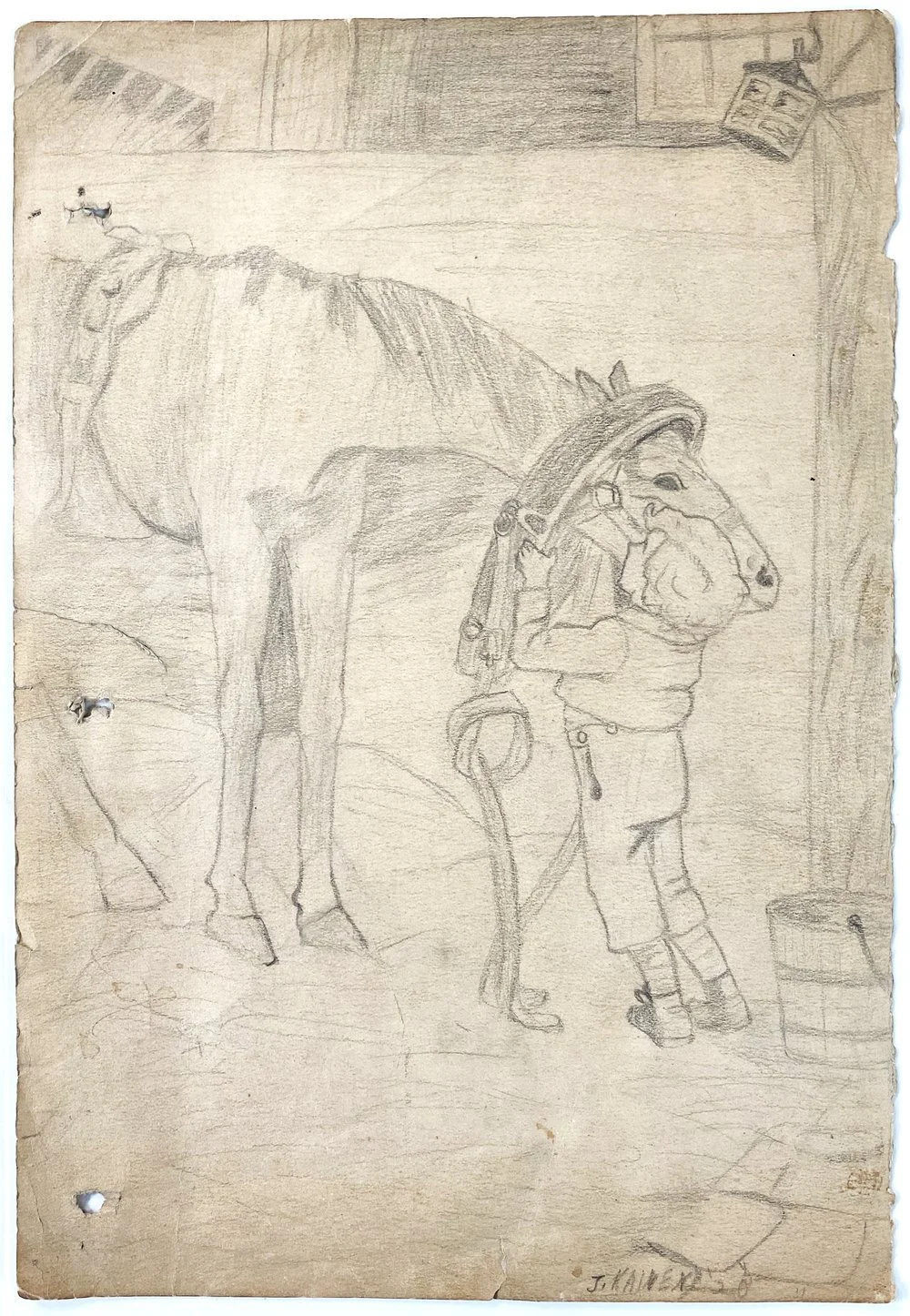
Student Work, 1920’s
Done in his junior year at Pratt Institute, at age 18, these studies are simple and straightforward, rendered in strong impasto technique, yet sensitive enough to show, for instance, a slight cataract in the wall-eyed gaze of an elderly woman model, as in “Woman in Black,” 1927, or rouge on a cheek, and the transparency of a lace shawl, as in “Copper Girl,” also 1927. He had not yet thought much about composition (“It’s the last thing you get.” he would say later), but the poses are solidly observed and well placed within the rectangle.

WPA
His work for the Federal Arts Project was, at the urging of his friend, Stuart Davis, only for its print division. Davis admired Kainen’s painting, and warned him that WPA paintings were sent to public buildings who knows where, and he’d never see them again. With prints, he’d still have the plates and the work wouldn’t be lost. In this period, he gravitated toward three main subjects: Disaster scenes, allegories, and street, or genre scenes.
Disaster Scenes, 1930’s
In the mid 1930’s Kainen painted disaster scenes with bold shapes, and rich colors. In “Tenement Fire,” 1934 the flames, hoses, jets of water, and dangerously leaning buildings evoke calamity. The treatment is not so much expressionist as his own brand of exaggerated forms, which also appear in “Disaster at Sea,” 1934, and “Flood,” 1935, where an anthropomorphized tree gestures helplessly amid the billows. “Invasion,” 1936, in response to the Spanish Civil War, is an invented jumble of cacophonous shapes, made more disturbing by conflicting, opposite colors of orange and green, with gas-masks suggesting death’s heads.


Allegories, Late 1930’s, Early 1940’s
Kainen was remarkably well-read (at 17, he was in charge of the classics section of Brentano’s book store) and very often referred to titles and characters from literature. In “Blake’s Angel”, 1940, an androgynous angel guides the hand of the poet, William Blake. In “Sampson and the Lion,” 1943, the exaggerated physiognomy of both man and beast are amplified through very visible large strokes and saturated colors. “Young Man’s Fancy,” 1939, vignettes the tempestuous dreams of youth, and “Young and Old,” of the same year, was personal: Kainen’s way of expressing his distress with his new wife’s father, whom he considered a burden, but would not outwardly say so.


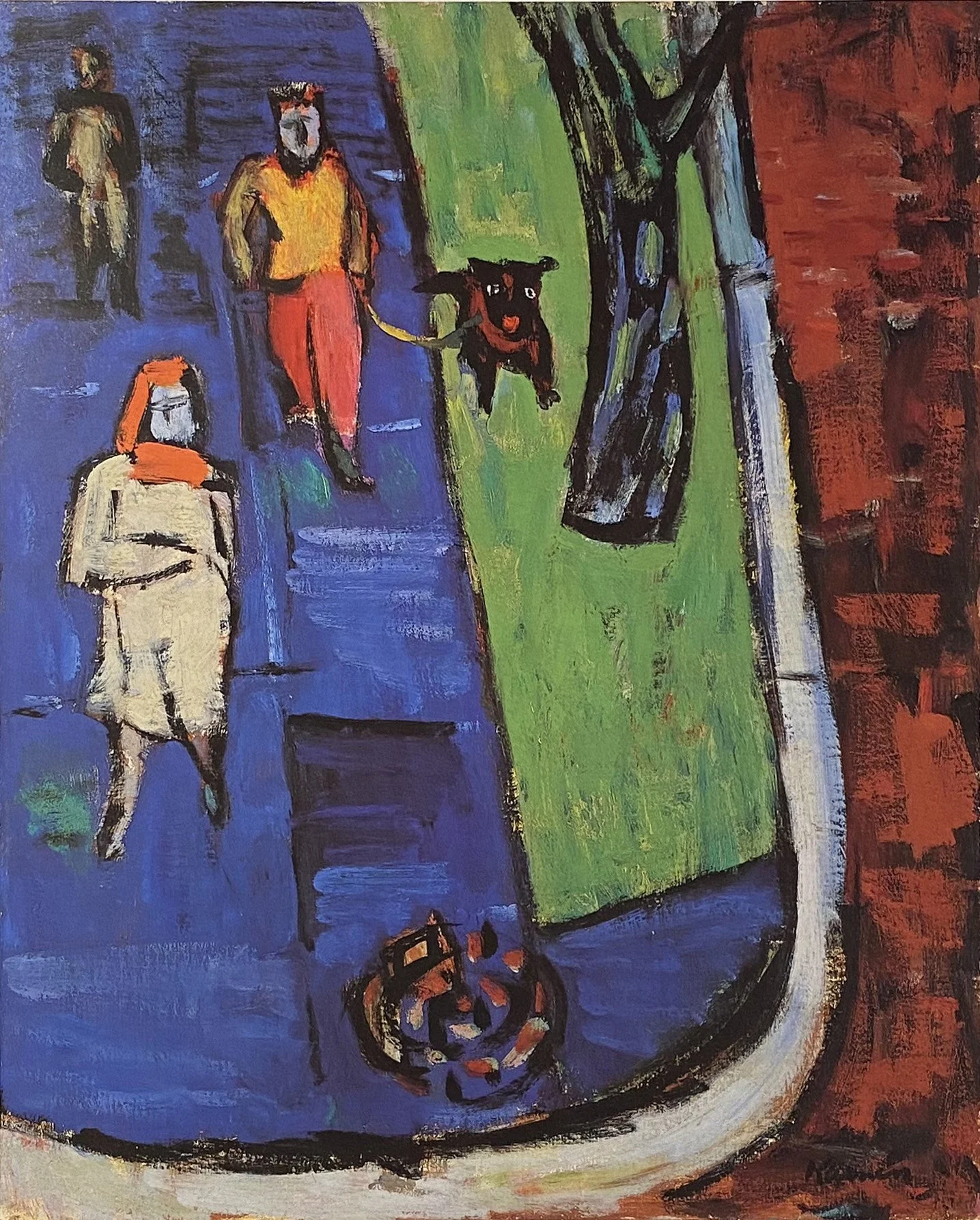
New York Genre Scenes, Late 1930’s
In these days, Kainen believed strongly in an art that ordinary, working people could appreciate, even though they had “been miseducated by magazine covers, illustrations, calendar covers, five-and-ten-cent-store etchings and other pictorial commodities” and so, while this period could be called Social Realism, it was not a strident critique of social conditions, or a glorification of the proletariat as some WPA art was, but carried more the tone of daily life, and was his way of bringing good art to the people. He wanted an every-day image, but also a lasting, timeless vision, and so rarely used what he thought would be distracting topical, or local references, such as real names in signs. For instance, the number, “20” appears in “Hot Dog Cart,” 1938, but all other letters and numbers are reduced to shapes. Likewise, in “Barber Shop,” 1939, the letters in signs over store windows are abstracted. The style is deliberately simplified, with shapes and forms bluntly and clearly rendered.
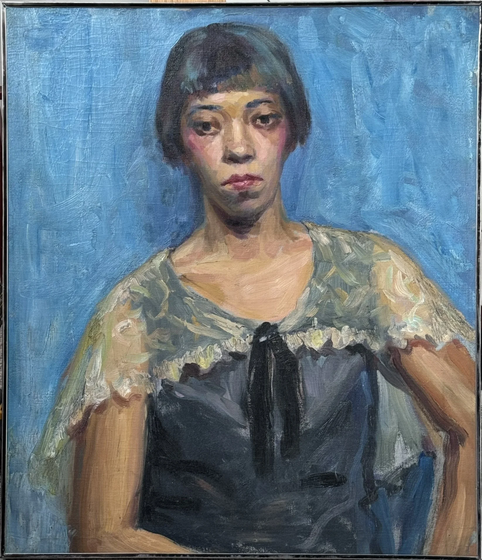
This deliberate pictorial simplicity, when compared to the very small, intimate and tender gouache portrait of Kainen’s fiancée, Bertha, done the same year as Hot Dog Cart, Shows a unique quality of Kainen’s art throughout his career: no matter how stylized or abstract the period of his work, he could always work realistically from life if he wanted to, and in a remarkable variety of styles and media. This virtuosity was not to show off, but to enhance whatever concept and feeling of a particular work. Another example of this versatility is the dead-spit portrait of Louis A. Weber, done a few years later in 1941, a keen psychological study, the body language and the tension in the facial muscles revealing aspects of the man’s character. In that same year, he painted the strongly colored “Street Breakers.”


The 1940’s, the Move to Washington, “The Walk,” and the Color School
Just after moving to Washington, D.C., his old friend Stuart Davis visited, and once again Kainen heeded his advice. Davis suggested he use a white palette – glass over white paper, rather than a wooden one, to mix his paints, so he could better see the color, a technique he used from then on. “The Walk,” from 1943, was the first painting done this way, and although its vibrant color was not such a dramatic departure from some previous works, such as “Street Breakers”. Nonetheless there is a clarity, of which the historian, William Agee, said: “In retrospect, we might ask if this work does not mark the beginning of the Washington Color School.” Though “The Walk” itself is not like a Color School painting, Kainen is known for inspiring and mentoring the artists of the Color School, who eagerly sought his knowledge of the many aspects of color: How to slightly mute a color with its opposite, so as not to have raw, or “acid” colors, but rather let their juxtaposition, and how they affect each other, create that same drama and strength. He taught how to control key, saturation, vibrancy, and value, and how to let colors show through each other in layers. Gene Davis said he had learned “more about art from Jacob Kainen than any other living artist.” When looking at Davis, or Tom Downing or Ken Noland, one can see Kainen’s influence in colors that, while bright and relatively intense, are not harsh or “right out of the tube” as one sees in some of the “hard edge” painters of the 1960’s for instance. When asked, Kainen declined to join their group because he did not share their desire to stain canvas, preferring not to “sacrifice mass,” as he put it.
D.C. Street Scenes, 1940’s
Aghast at the artistic backwater that was D.C. when he arrived, nonetheless Kainen was intrigued with its Victorian architecture. Its townhouses, with their turrets, evoked what he called “threatening shapes”, and the lower skyline also had a different quality of light. As the 40’s progressed, Kainen’s work became more inventive in form and color as in “Side Street,” 1947, and then further abstracted in “Street Corner With Red Door,” also 1947. In “Central Park Lake,” 1948, representationalism is more due to the title of the piece than any other reason. His color remained tempered, with many secondary, rather than primary hues: yellow greens, aquas, violet-greys, muted blues and reds. They are very much his own colors, although they have been mistakenly thought to embody French and German influences. “Residential Facades,” 1948, is another good example of how he coined the visual phrase of his new surroundings.


The Angst of the McCarthy Era
The 50’s were the McCarthy era, and Kainen was was told by friends on Capitol Hill that he was under investigation, since he had attended Communist meetings in the 30’s, as many New York artists in that time did. In addition, he was of Russian descent. an intellectual, and most importantly, worked for the Government so was a likely target. Therefore, he kept a low profile, preferring not to show, even as his old friends were becoming famous. His abstractions now reflected the troubled currents that threatened creative thought. In “Hour of the Beast”, 1953, a reference to Yeats’s poem, “The Second Coming”, and a veiled declaration of his contempt for McCarthy, a chimera-like beast is evoked from strong, sharp, dangerous-looking shapes. This painting was given first prize in an area show by none other than George Grosz, the German painter and expressionist. Less specific, yet sharing the same visual grammar, is “Marauder”, of 1951. Despite being highly abstracted, the forms in these paintings are evocative of a terrifying reality. This expressionist approach becomes figurative in “Stranger In the Gates,” 1957, with a human figure whose nature seems to alternate between threat and vulnerability. The figure itself, in pinks and reds, is lacerated-looking, reminiscent of Rembrandt’s “Flayed Ox,” which Kainen had seen a few years before on his first trip to Europe in ‘56. The color is intense, and the composition strong; the figure on the left, as well as notes of color also at the far, and upper left, balance the powerful, black bars of the gate on the right. “Witness II,” 1950, is one of the only paintings that shows an influence of Kainen’s mentor, Arshile Gorky.


Pure Abstraction, 1950’s
These are the first of Kainen’s works to substantially depart from the idea of a “protagonist shape”, creating harmonious ensembles of color, and, certainly in both “Rose and Gold,” 1956, and “Bright Stamboul,” 1957, shape itself is far less defined, appearing as strokes and areas, rather than distinct forms. “The Coming of Surprise,” 1951, is a jazz composition of dynamic shapes, and stroke-shapes, some larger, some smaller, but equal and inter-dependent, rather than a single, prominent entity. “Emerge and Shine,” 1955, has a prominent area of yellow, framing the red-orange shape within it, which takes pride of place, but is still not so much in tension with its surrounding strokes and slashes of color, as enhanced by them.
Rose and Gold, 1956 20 x 16
Bright Stamboul, 1957 20 x 26
The Coming of Surprise, 1951 30 x 24
Emerge and Shine, 1955 36 x 28
Return to the Figure in the 1960’s
Ever against the tide, Kainen returned to the human figure in the 1960’s, with some of the most original approaches to it in American art. Whether expressionist, monumental, or stylized, the figures give off a psychological aura. His control of the medium brings to mind his response during an interview: “It’s the art of painting. You do it with the paint.”
Expressionist Figures, 1960’s
As the influence of the troubled 50’s waned, the return to the figure took an expressionist turn, as in “The Pair,” 1960, with ever more primary-leaning color and brushwork, evoking a strong psychological aura, reinforced by an equally bold and uncompromising composition. In “Crimson Nude,” 1961, drawing is implied, rather than rendered, with large, sweeping strokes, yet the pose of the figure in its setting is clear. Although it didn’t have the angst of the McCarthy years, Kainen considered it an unsustainable “violent expressionism”, for which “one must work up a state of madness every day before painting”, and noted that Kandinsky was only an expressionist for a few years before “calming down.”


Monumental Figures, 1960’s
In tandem with his more expressionist approach, Kainen sought a monumental, dignified quality in the human figure. Using dark against a light ground, he tempered the introspective aspect of a lone figure with free, expressive brushwork, as in “Woman On a High Stool”, 1961, and “Pregnant Woman,” 1962. At this time he spoke of the contrast between “monumentality and spontaneity”. The facial features are formalized, and the figures are rendered with arbitrary, intense colors at their edges, whose outward, chromatic auras were intended to take the place of the classical, light figure, radiating against a dark ground. Kainen called this “reversing Caravaggio”, whose dramatic chiaroscuro he described as having “broke the back of the Renaissance”. Despite their loose brushwork, the solitary, monumental figures have a strong, classical feel with solid, underlying forms.
“Pregnant Woman At A Pedestal”, 1962 61” x 48”
“Woman In Black On a High Stool”, 1961 48 x 37
Stylized, Transitional Figures, Late 1960’s
Mid-decade came a desire for a bolder view. “The Waiting Room,” 1966, is often mistakenly thought to be influenced by Matisse, because of the ornament of the window arabesque, and perhaps because there is a sense of pattern in the flattened, stylized female figure. Matisse, however, while patterned, is not as calligraphic, and it is just that energetic, calligraphic verve in the window and its curtain, echoed by the shadow form at the left of the figure, as well as the loose, sketchy lines in the male figure, that impart the needed motion to what otherwise would have been a more static juxtaposition of the two figures. The female figure is kept flat and stylized, and the male figure loose and sketchy. The red of the woman’s dress is quite intense and throbs when viewed full size. Touches of opposite color, like the yellow-green against the orange wall, next to the curtain, and the green against the dark red-brown of the floor, key up the vibrancy.
In “Pale Nude”, 1969, we see a muscular exaggeration of the female form, mannerist in feeling, but fluidly and gesturally painted, rather than the highly delineated mannerism of the 16th century. The dynamic composition springs upward to the left along the figure’s leg and torso, where it bounces upward and to right from the shoulders, aided by the active diamond shape in the upper right corner. The space around the figure is broken up into shapes that pass through each other, hinting at shadows and space, while keeping flat. The pale figure and its pale chair become a larger shape, keeping the figure from appearing too stark.
“The Waiting Room”, 1966, 50” x 44”
“Pale Nude”, 1969 50 x 44
Totemic Figure-Symbols, 1970’s
“The couple“, 1969, begins the totemic abstraction of male and female forms. The figures, broken into shapes, create a composition in which the curves of the female on the right are contrasted with the straighter lines of the male to the left. The downward and upward pointing triangles emphasize the figures’ sexuality.
As the 70s emerge, “Arctic Figure” uses sharp, dynamic shapes to take the totemic approach further. The green shape borders on being a figure, but the blue shape foretells succeeding paintings in which the shapes become symbols of figures.
”The Couple II”, 1969 48 x 60
“Arctic Figure”, 1970 32 x 40
Hexagonal and Circular Protagonists, 1970’s
The Totemic Figure-Symbols become more abstract with the use of hexagons and circles, and become an expression of a more basic, more pure relationship between an entity and its surroundings.
To keep these shapes from being static, there is a calligraphic verve to the edges of the shapes themselves, as in “Observer X,” 1974, whose transparent, cream-colored rectangle seems to spring left and upward from the lower right hand corner, imparting a rocking motion to it. The blue spots in its upper right, and brushed-in red area in the upper left are typical of the many touches of color, and arbitrary strokes in these paintings which add dynamic atmosphere. There are also subtle color variations within areas, and sometimes touches within the hexagon, as in “Aladdin II,” 1977. Edges are also carefully controlled as to sharpness, as in “Nova I,” 1977 in which also a shadow form is used to create a more specific sense of space. “Observer XXIX,” 1977, adds a lyric, flower-like motif within the orb. All of these things contribute to the dynamic tensions surrounding the protagonist shape.
“Observer X” 1974 60 x 48
“Aladdin II” 1973 48 x36
Nova I, 1977 80x60
Observer XXIX, 1977 48 x 36
Geometric (Philosophical) Abstraction, 1980’s
So-called because of their more severe space-division, they are not geometric in the true sense of the word, and are certainly are not like the so-called “hard edge” painters of the ‘60’s. Kainen didn’t believe in using masking tape, and wanted the sensitivity that painted edges gave. The boundaries are sometimes clean, but they are also often carefully worked, and sometimes blurred. These pieces again depart from a strictly protagonist shape, and the distinct areas within the canvas seem to exist not in tension, but in more ambiguous relationships. In “Lumen III”, 1980, the tilted diamond shape is not symmetrical; the axis between top and bottom apexes does not form a right angle to the axis between the left and right ones; that horizontal axis slants downward to the right, and the darker blue lines outside of the diamond hint at meeting beyond the edges of the canvas. They could be expanding or, because their outer edges are blurrier than their inner ones, constraining. When one stands in front of this large work (and this is true of all of Kainen’s later work), surprises happen. One sees that he white area of the diamond is not static, but scumbled over a very faintly darker color, and in “The Way”, 1979, the upper left shape is also one color scumbled over another, in this case, yellow orange over yellow green, creating an optical ochre, and both left hand shapes could suggest a totemic figure if taken together, or perhaps a landscape and sky separately. The white area could perhaps be a curtain drawn aside from the mysterious stack of organically proportioned rectangles on the right, revealing a questionably blank field behind it. These plastic ambiguities, coupled with the large scale of the pieces, become psychological ones, causing the viewer, consciously or not, to meditate on their meaning, and these works perhaps could more accurately be called “Philosophical Abstractions”. These pieces exemplify the phrase in Kainen’s quote about “an aura of human experience”: “particularly that of the lonely Faustian thinker, combining wisdom and magic.”
The Way, 1979 60 x 80
Lumen III, 1980 72 x 54
Lyrical Journeys, 1980’s and 1990’s
The “Argosy”, “Aegean” and “Pilot” series of the 1980’s, are joined by “Envoy”, 1990, with a preponderance of rectangular shapes, but also orbs and linear striations that suggest currents through which these shapes seem to be traveling. The shapes are protagonists in a way, but not so dramatic as in earlier works, such as the Totemic ones. Once again, there are many touches, small strokes and dots, as well as variations in background color to keep the composition dynamic. In all of them is the feeling of a journey of some kind.
In “Argosy LIX,” 1989, white, coral, and black rectangles have smoother sides than their undulating tops and bottoms, suggesting a directionality as they float against the blue ground. Likewise in “Envoy”, 1990, the dark blue central, vertical lines seem to define a seam in the milieu in which the muscular white shape is suspended. The brown shapes at lower left and upper right create an axis of travel and the colorful strokes at upper left add movement and chromatic ambience.
Argosy LIX, 1989 72x60
“Envoy”, 1990 32x39
Drawings and Prints
Kainen was a prodigious printmaker throughout his entire career, making his first drypoints with his mother’s clothes wringer at age 16, and then learning more when he joined the graphics division of the Federal Arts Project. In childhood he drew from reproductions of famous artists, and painted copies of masters from the Metropolitan Museum as a teen. He never stopped drawing from life, whether sketching outside, or from models in the studio, no matter how abstract his current concept in his paintings and prints.